Two Hands, One Photo: How a Property Handover Kit Behaves at the VP Counter
Every vacant possession handover in Malaysia now ends the same way: someone raises a phone. The buyer photographs the keys. The project marketing team photographs the buyer. One of those images ends up on a developer’s social feed, and the other ends up in a family group chat. The kit you ordered is the only branded object in either frame — and it is being judged in about a second and a half.
Most briefs for property handover kits Malaysia developers send us describe the object at rest: material, colour, logo, box. Almost none describe the object in use — held at chest height, half open, in front of a printed backdrop, under a ceiling of fluorescent tubes in a temporary sales gallery. That gap is where premium-looking kits go wrong, and it is also the cheapest thing in the whole project to fix, because it costs nothing to specify correctly at mockup stage.
This article covers three things a photograph forces you to decide: how the kit behaves in two hands on camera, which brand goes where when a developer and a project have different identities, and how a counter serving unit after unit all day keeps the object looking new on the fiftieth handover. It assumes you have already settled the key set a unit actually hands over, because a kit that does not fit its contents cannot be rescued by photography.
The handover photograph is a two-hand shot
Watch a handover counter for an hour and the same gesture repeats. The developer’s representative offers the kit with both hands. The buyer receives it with both hands. Both people turn towards the camera. Then, almost always, the buyer opens it — because the natural thing to do with a folder someone has just handed you is to look inside.
That sequence sets four requirements almost nobody writes into a brief.
It has to stay shut while it is offered, and stay open while it is looked at. A flap that springs open mid-handover ruins the shot; a folder that will not stay open forces the buyer to use a third hand they do not have. A magnetic or elastic closure with a cover that lies reasonably flat when opened solves both. Ask for this specifically at mockup stage — hold the sample out at arm’s length, let go of the flap, and see what happens.
The logo has to survive being gripped. Two pairs of hands on one object cover an enormous amount of surface. If your mark sits centred and small, four thumbs will hide it. Placing the mark in the upper third of the cover — above where hands naturally hold — keeps it visible in the exact frame everyone is trying to capture.
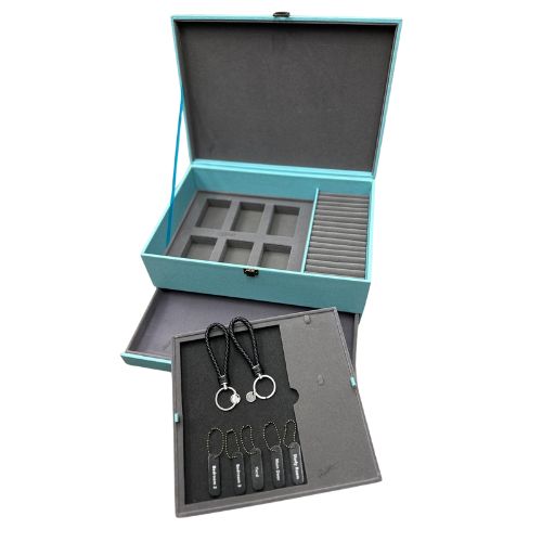
The inside is on camera too. The moment it opens, the lining, the key panel and the welcome insert are all visible. A beautifully finished outside with a bare grey lining reads as a downgrade the instant it opens, and that is usually the frame the buyer photographs.
It reflects light. Sales galleries and temporary handover rooms are lit from directly overhead. A high-gloss cover under downlights becomes a white blob at exactly the angle the object is held. Matt and lightly textured surfaces photograph far more reliably in that environment, which is one reason pebbled PU has become a default for this category rather than a smooth mirror finish.
The two-minute mockup test. When your physical sample arrives, do not photograph it on a desk. Hand it to a colleague, both of you hold it, and take the picture on a phone under your office ceiling lights. Then open it and take a second one. If either image looks flat, the problem is the specification, not the photographer.
Two brands, one cover: the placement map
Malaysian property marketing almost always involves two identities. There is the developer — the corporate mark that appears on hoardings, annual reports and every other project. And there is the project itself, with its own name, wordmark, colour and often a completely different typographic style. A joint venture adds a third. Deciding which mark goes where is not a design preference; it decides whether the kit still makes sense in five years and whether the tooling can be reused on the next phase.
The rule we recommend is simple: the durable surface carries the durable brand. The developer’s mark goes on the cover, where it is debossed or foiled into the material and cannot be changed. The project’s mark goes on the parts that are printed, inserted or replaceable. That way the same folder body serves phase after phase, and only the printed elements change.
| Surface | Which mark belongs here | Method | Reusable next phase? |
|---|---|---|---|
| Folder cover, upper third | Developer corporate mark | Blind deboss or foil | Yes — same die across phases |
| Inside lining panel | Project wordmark, tone-on-tone | Print on lining | No — phase specific |
| Welcome insert card | Project identity, full colour | Offset or digital print | No — reprint per phase |
| Presentation box lid | Project mark, developer endorsement line | UV or offset print | Partly — artwork change only |
| Key tag or keepsake | Project mark only | Engraving | No — phase specific |
| Joint venture partner mark | Insert card, never the cover | No |
There is a commercial reason to hold this line. A debossing die is made once. Put the project name into the die and you buy a new one for every launch; keep the die corporate and the project identity moves to print, where a change costs an artwork revision rather than tooling. Developers running several launches a year notice this quickly, and it is a large part of why a condo handover gift set should be specified at portfolio level rather than project by project.
The counter: fifty handovers, one object, all day
A handover counter is not a gift table. It processes appointments back to back, each one involving identity checks, signatures, meter readings, key issue and a defect briefing. The kit is handed over at the end of that, when everyone has been standing for six hours. Design for that reality and the presentation holds all day; design for a launch event and it degrades by lunchtime.
Where kits are staged matters more than how they look in the carton
Kits stacked on an open counter collect dust and fingerprints from the first appointment onwards. PU and leatherette hold fingermarks noticeably on darker colours and on smooth finishes; pebbled grain hides them far better. Stage the day’s kits behind the counter in their cartons, bring out a small number at a time, and keep the rest sealed. If your kits are boxed, keep the boxes closed until the appointment — an open display box is a dust tray.
One kit per appointment, prepared one appointment ahead
The failure mode at a busy counter is not a damaged kit, it is the wrong one — the unit insert from a different unit, or keys placed in a kit already promised to the next appointment. Prepare exactly one kit ahead, with the unit’s removable insert placed in it, and keep it physically apart from the staged stock. It sounds trivial until you watch a team try to unpick two swapped kits with four buyers waiting.
Keep a small presentation reserve
Some kits will be scuffed, marked or opened during the run. Order a modest overage above the unit count so the counter never has to hand over a marked kit, and so late reallocations and re-handovers are covered. Building that reserve into the first order is far easier than requesting a small top-up run later — a point that matters a great deal when you are phasing kit deliveries block by block.
Premium or cheap: what the camera actually picks up
Buyers cannot assess material quality from a photograph, and neither can anyone scrolling past it. What reads instantly is proportion, edge finish and consistency. Four things separate a kit that signals a premium project from one that signals a cost line item.
Edges. A raw cut edge, a visible glue line or an uneven stitch along the cover is the first thing that reads cheap, because it is the highest-contrast detail in the frame. Painted or turned edges cost more and are worth the difference on the cover panel alone.
Fill. A kit that is visibly under-filled sags in the middle and photographs as an empty wallet. This is the argument for sizing the folder to the real document stack rather than buying a generous one and hoping.
Colour agreement. Your project palette will not reproduce identically on PU, on printed card and on a coated box — three different substrates, three different results. Rather than chasing an exact match across all three, choose one hero surface to match precisely and let the others sit in a deliberately neutral tone. Mismatched near-misses look worse than an intentional contrast.
The insert card. A crisp, well-printed welcome card on decent stock lifts the whole kit at almost no cost. A thin card with a stretched logo undoes a good folder. It is the cheapest component and the one buyers actually read, which is also why it is the natural home for where defect reporting details belong.
Questions project marketing teams ask
Should the developer logo or the project logo go on the folder cover?
The developer’s, in almost every case. The cover is the permanent, tooled surface; the project changes every launch. Put the project identity on the insert card, the lining print and the box, all of which can be reprinted without new tooling.
Can you match our exact project colour on the folder material?
Custom material colours are possible, and we will always show you a physical swatch before production rather than a screen render. Be aware that a dyed PU, a printed card and a coated box will never read identically; pick one hero surface for the exact match and design the others to complement it.
How far ahead do we need to order for a handover date?
Production runs 20 to 30 working days after artwork approval depending on quantity, plus roughly 15 days shipping, so work back from your first appointment date and add time for mockup review. An express route of 10 working days exists for limited styles and quantities if a date moves in on you.
What is the minimum order for a property handover kit?
From 300 pcs. Send your logo files, your project palette and the folder specification and we will return a free digital mockup, usually within one business day, with an SST invoice on the confirmed order and ePerolehan-compatible documentation where a public-sector buyer is involved.
Send both logos. We will show you where each one belongs.
Give us your corporate mark, your project identity and the handover date, and we will come back with a mockup of a property developer gift Malaysia buyers will actually photograph — from 300 pcs, delivered nationwide from our Kuala Lumpur office.
WhatsApp +60 10 717 5924 · Brief us through our contact page · AS80, Jalan Hang Tuah 4, Taman Salak Selatan, 57100 Kuala Lumpur.