One Logo, Five Surfaces: Why Stationery Kits Look Mismatched When the Box Opens
Nobody notices a slightly-off logo on a single notebook. Open a gift box containing five branded items and the eye does something else entirely: it compares. Within a second the recipient has judged whether the notebook, the pen, the pouch, the card and the lid came from the same brand or from the same shopping trip. That comparison is the whole reason kits feel premium — and it is the reason a kit is far harder to brand than any of the items inside it.
The mismatch is not usually a mistake by anyone. It is what happens when one logo file is sent to five different processes, each of which does something physically different to it: one presses it into leatherette, one burns it off a metal barrel, one lays ink on top of woven fabric, one stamps metallic foil onto board, one prints it in full colour on paper. Same artwork, five different outcomes. Here is what each surface does to a logo, and the rule we use to keep a kit reading as one designed object.
The short version
Do not try to reproduce your logo identically on five materials — it is not possible. Instead, nominate one hero item, decorate it as well as the material allows, and then derive a simplified, consistent treatment for everything else in the kit. Coordination comes from consistent size logic, position logic and colour intent, not from identical printing.
The mismatch you only see when the lid comes off
Three specific mismatches account for almost every kit that looks wrong on arrival. The first is scale drift: the logo is 60 mm wide on the notebook and 35 mm on the box lid, which is fine — but it is also 12 mm on the pen, where the wordmark has become a smudge. The second is colour drift: the box prints a clean brand green, the pouch prints a duller green because the fabric is dyed rather than coated, and the pen has no colour at all because it was engraved. The third is position drift: bottom-right on one item, centred on another, top-left on a third, because each factory defaulted to its own standard placement.
None of the three shows up in a flat-lay mockup viewed at screen size. All three show up instantly in a real box. Ordering custom stationery with logo as a set therefore needs one more approval step than ordering the same items separately: a coordination review, not just an artwork review.
Five surfaces, five different logos
This table is the one we work from when a kit brief arrives. Read the third column as the honest answer to “will my logo look like my logo?” — because for two of these surfaces, the answer is no, and that is by design.
| Surface in the kit | Usual method | What it does to the logo | What breaks first |
|---|---|---|---|
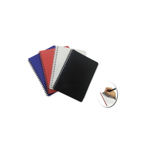
| Notebook cover (PU, leatherette, kraft) | Deboss, or foil on deboss | Removes colour entirely; the logo becomes shadow and depth | Fine strokes and counters fill in; heavy grain swallows detail |
| Metal pen barrel | Laser engraving | Reveals the base metal beneath the coating — you get silver or brass, not brand colour | Width: a curved barrel gives you a narrow strip, so tall logos must be re-locked-up |
| Fabric pouch or zip case | Screen or transfer print; embroidery on heavier fabric | Ink sits on a dyed, textured surface — colours read softer than on paper | Small type; embroidery loses anything below a legible stitch size |
| Gift box lid (coated board) | Foil stamp, or full-colour print | Foil is a metallic finish chosen from a stock range, not a brand colour match | Registration on a large lid; foil on a textured wrap |
| Insert card (uncoated paper) | Full-colour print | The most faithful reproduction in the whole kit — and the reference everything else is compared against | Uncoated stock absorbs ink, so colours sit slightly flatter than on the box |
Notice the fifth row. The insert card is usually the cheapest printed item in the box and the most colour-accurate, which makes it the involuntary benchmark: the recipient compares every other item against the card because the card is the only place their brand looks exactly right. That is a good argument for deciding the card’s role early rather than treating it as an afterthought — see the insert card and how to brief it.
Artwork tip: a logo that survives at 60 mm on a notebook cover can disappear at 12 mm on a pen. Before you approve a kit, print your logo at each item’s real branding width on plain paper and look at it from arm’s length. If the tagline is unreadable at 12 mm, remove the tagline from the pen — do not shrink it.
Colour: one reference, five different results
Brand guidelines usually specify a single colour reference. Kits break that assumption, because colour is a property of the material as much as of the ink. The same green reads brighter on a coated box lid than on an uncoated card, softer again on dyed fabric, and does not exist at all on an engraved barrel or a debossed cover. Insisting on an exact match across all five is the fastest way to stall a kit in approvals.
The workable approach is to sort the kit into three colour groups and set an expectation for each. Group one, matched: printed items on paper and board — box, card, sticky notes — which should sit close to each other. Group two, approximate: printed or embroidered fabric, where you accept a near match and approve it on a physical swatch rather than a screen. Group three, colourless: engraved metal and debossed covers, where you are choosing a finish, not a colour. Once a client sees the kit sorted this way, the arguments stop, because everyone is judging each item against the right standard.
If your kit leans on a debossed or foiled cover as its hero, it is worth understanding how those two methods behave on different cover materials before you lock the design — our guide to why a debossed logo disappears on textured PU covers that in detail so this article does not have to.
The hero-item rule
This is the framework we apply to every kit brief, and it takes about twenty minutes to run.
- Name the hero. Pick the one item the recipient will keep longest and look at most — usually the notebook, sometimes the pouch. This item gets the fullest logo treatment: full lock-up, tagline if you have one, the largest sensible size.
- Define two simplified marks. A medium version — logo without tagline — for mid-sized surfaces like the box lid and the pouch. And a minimum version — symbol only, or wordmark only — for the pen and any small item.
- Assign one mark per item, in writing. Every component in the kit gets exactly one of the three versions. No item gets a bespoke treatment invented by whoever set up its artwork.
- Fix a position logic, not a position. “Centred on flat surfaces, left-aligned on long narrow surfaces” travels across a kit far better than “always bottom-right”, which is impossible on a pen barrel.
- Set one accent to carry the brand. Where colour cannot be reproduced, let a single element carry it: the box interior, the belly band, the elastic closure, the card. Recipients read that accent as the brand colour even when the engraved pen is silver.
The last point is the one that surprises people most. A kit does not need every item to be brand-coloured. It needs the brand colour to appear decisively at least once, at the moment the box opens.
The artwork pack a kit actually needs
A single logo file is not an artwork pack for a kit. What speeds a kit through production is a small, boring folder containing:
- Vector files (AI, EPS or PDF) of all three mark versions, with text converted to outlines.
- A one-colour and a reversed (white) version of each — engraving and deboss need single-colour art, and dark box interiors need the reverse.
- Your colour references, with an explicit note on which items must match and which may approximate.
- A one-page item-to-mark map: component, mark version, position logic, approximate branding width.
- The insert card copy, already signed off, in final wording.
Every item in that list removes a question from the production floor, and questions are what turn a 21–45 day production window into a longer one. It also feeds directly into the assembly sequence that builds each box, because the mark map doubles as the packer’s reference for which variant is which.
The mockup review that catches mismatch
We issue a free digital mockup, usually within one business day of your brief. Most clients check it for spelling and colour. For a kit, ask these five questions instead:
- Is every item shown at its real relative size, side by side — not each on its own slide?
- What is the branding width in millimetres on each item, stated as a number?
- Which items are colour-matched, which are approximate, which are colourless?
- Which mark version is on each item, and does that match the item-to-mark map?
- What does the kit look like with the lid off, from directly above, at arm’s length?
The last question is the one that matters. A kit is experienced as a single top-down view for about two seconds before anything is picked up, and that view is what your mockup should show. Once approved, that same top-down reference becomes the standard for checking sealed kits before they leave the floor.
When to break the rule deliberately
Two situations justify deliberate inconsistency. In a co-branded kit — a joint event, a sponsor set — the two logos should never fight on the same surface; give each partner its own items and keep the box neutral. And in a premium executive set, less branding reads as more expensive: an unbranded metal pen beside a discreetly debossed cover often outperforms the same kit with a logo on all six items. If the recipient is a client rather than a colleague, restraint is usually the stronger choice.
Frequently asked questions
Can you match our exact brand colour across every item in a kit?
On printed paper and board, yes, closely. On dyed fabric, close but not identical. On engraved metal and debossed covers there is no colour to match — those are finishes. We will tell you which group each item falls into before you approve, so nothing is a surprise at delivery.
What file format should we send for a kit?
Vector — AI, EPS or PDF with outlined text. A JPG or PNG can be redrawn, but redrawing adds days and introduces the risk of a stroke weight changing. Send a one-colour and a reversed version too; engraving and deboss both need single-colour art.
Should every item in the kit carry the logo?
No. Two or three well-placed marks usually look better than six. Brand the hero item properly, mark the box, put the message on the card, and leave the smallest components clean unless they will be used away from the desk.
How many kits do we need to order?
From 200 pcs, varying by the components you choose. Branding methods do not usually change the minimum — the components do.
Send your logo, and we will show you the kit from above
Tell us the components, the recipients and your brand colours, and we will map one logo across every surface in the box — with branding widths in millimetres and an honest note on what will match and what will approximate. Kits from 200 pcs, delivered nationwide across Malaysia, SST invoice and ePerolehan-ready documents for government buyers. Aquaholic has been a Singapore-based corporate gifting specialist since 2003 and now works from Kuala Lumpur — request a free mockup for your stationery printing and see the whole kit before it is made.
WhatsApp +60 10 717 5924
Send your artwork
Aquaholic Gifts Malaysia · AS80, Jalan Hang Tuah 4, Taman Salak Selatan, 57100 Kuala Lumpur · Mon–Fri, 9:00am–5:00pm