Custom Tie With Logo: What’s Actually Visible Once It’s Knotted
A tie is roughly 145cm long. About 25cm of it is inside the knot, another 40cm is hidden behind the front blade, and a further stretch disappears under a buttoned jacket. What a colleague across a meeting table actually sees is a panel of perhaps 25 × 8cm. Every branding decision on a tie is really a decision about that panel.
This is the single most common misunderstanding we correct at artwork stage. A logo positioned beautifully on a flat tie layout can end up folded inside the knot, hidden behind the blade, or sitting below the jacket button where nobody will ever see it. This guide sets out the four zones of a custom tie with logo, what each one is genuinely for, and how to decide before your designer starts.
The anatomy of what is visible
Measuring from the top of a standard knot downward on a typical wearer:
| Zone | Roughly where | Visibility |
|---|---|---|
| Inside the knot | Top ~25cm of the blade | None — folded and compressed |
| Just below the knot | Next ~10cm | Highest — the eye goes here first |
| Mid blade | Next ~25cm | High when standing, lost when seated at a desk |
| Blade tip | Final ~15cm | Variable — often below the jacket button |
| Rear blade | The narrow end behind | None in normal wear |
The mirror test. Before approving any tie artwork, print it at actual size on paper, cut it to the blade width, and hold it against your chest with the top 25cm folded away behind. What remains is your real estate. Most people are surprised by how little of their design survives, and by how much of it sits below the point where a jacket closes.
The four branding zones
1. All-over repeat
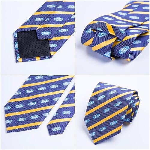
A motif tiled across the whole tie — the traditional corporate and institutional treatment. Visibility is guaranteed because no fold, knot or jacket can hide a pattern that exists everywhere, which makes it the only genuinely fail-safe option.
The craft is in the motif. A literal full logo repeated across a tie reads as merchandise and gets worn reluctantly. An abstracted mark — a monogram, a crest, an initial, a geometric derived from the brand — reads as heritage and gets worn willingly. Tile spacing of roughly 30–60mm suits most tie widths; below 30mm the motif reads as texture, above 60mm the pattern looks sparse on a 7cm blade.
2. Single mark below the knot
One logo placed in the highest-visibility zone, typically 20–30mm wide, sitting roughly 5–10cm below where the knot ends. Discreet, modern, and it puts the branding exactly where attention lands.
Its weakness is that it depends on the wearer tying a consistent knot. A Windsor consumes noticeably more length than a four-in-hand, so a mark positioned for one can end up half-swallowed by the other. If your staff are not trained to a single knot, either accept some variation or move the mark lower into the mid blade.
3. Blade tip mark
A logo near the bottom of the front blade. It reads as understated and it is common on club and association ties. Be aware that a buttoned jacket frequently covers this zone entirely, and that the tip is also the area that takes the most soiling from desks and seatbelts. Best for settings where jackets are not routinely worn.
4. Keeper label and tipping
Not on the face of the tie at all. The keeper is the small loop on the rear blade; the tipping is the lining at the back of both tips. Branding either one is invisible in wear and read every time the tie is handled, tied or put away.
This is the right answer when visible branding would be a discourtesy — board-level gifts, VIP delegations, ministerial protocol gifts — and it combines with any of the three face treatments above. It is also how most luxury houses brand a tie, which is precisely why it reads as expensive.
Placement decision table
| Zone | Survives a jacket? | Survives knot variation? | Reads as | Best for |
|---|---|---|---|---|
| All-over repeat | Yes | Yes | Institutional, owned | Banks, schools, clubs, government |
| Below the knot | Yes | Only with a consistent knot | Modern, deliberate | Corporates, events, hospitality |
| Blade tip | Often not | Yes | Understated | Jacket-free workplaces, associations |
| Keeper / tipping | Not visible either way | Yes | Quiet provenance | Board gifts, VIP, protocol gifts |
The bias-cut trap
Tie cloth is cut at 45° to the weave — that is what stops a tie twisting on the wearer. It also means the design you supply flat arrives rotated roughly 45° on the finished tie.
- Horizontal stripes in your file become diagonal stripes on the tie. This is normal and expected — the classic regimental diagonal is a horizontal stripe on the flat cloth.
- A logo with a reading direction must be counter-rotated in the artwork so it sits upright on the finished tie. Send it flat and unrotated and it will arrive tilted.
- An all-over repeat should be planned on the diagonal from the start, or the tiling grid becomes visible as an unintended diagonal channel.
- Ask for the proof showing the rotation applied. If the mockup still looks square on the page, the rotation has not been accounted for yet.
Sizing the mark
A tie blade is typically 7–9cm wide, and hemming plus the fold at each edge consumes some of that. Working figures our team applies:
- Single mark below the knot: 20–30mm wide on a standard blade, 15–22mm on a 7cm slim tie.
- All-over repeat motif: 30–60mm tile, held constant regardless of blade width.
- Keep everything 15mm clear of the blade edges — the edges fold and stitch, and anything closer is lost into the seam.
- Minimum line weight is roughly 0.5mm printed and 1.5mm woven, which is often the deciding factor between the two routes — see whether your logo can be woven at all.
- No taglines. Small supporting type under a wordmark is not legible at tie scale in either method.
A Malaysian protocol note
Placement carries a courtesy dimension that is easy to miss working from an international template. Three points from orders we have handled:
- Government and statutory-body recipients: keep face branding subtle or move it to the keeper entirely. A boldly branded tie can read as promotional material rather than a courtesy gift, and procurement teams working to ePerolehan norms tend to prefer the discreet option.
- Mixed-faith and mixed-gender workforces: where a tie is part of a uniform worn by some staff and a scarf by others, design both around one abstracted motif rather than two different logo treatments. It keeps the programme coherent and avoids either group feeling like the afterthought.
- Ceremonial and Merdeka-season orders: an all-over repeat tends to photograph better in group settings than a single small mark, which vanishes at any distance in a formal photograph.
Making the tie and the scarf work as one programme
Most uniform programmes here are not tie-only. Male staff get a tie, female staff get a scarf, and the two are ordered separately — often months apart, sometimes from different suppliers. The result is a floor where the two halves of the workforce are visibly wearing different brands.
Four things make them read as one programme:
- One motif, two applications. Design a single abstracted mark and apply it as an all-over repeat on both items. Do not design a tie pattern and then commission a separate scarf pattern — they will not sit together, however carefully briefed.
- Order both against the same strike-off. A tie in polyester silk and a scarf in chiffon will not take colour identically, so approve them together on a single physical reference rather than sequentially against a Pantone number.
- Scale the motif per item, not per format. A 40mm tile that looks right on a 90cm scarf reads as too sparse on a 7cm tie blade. Hold the visual density constant and adjust the tile, typically 30–60mm on the tie against 40–90mm on the scarf.
- Order them in the same production window. Same dye run, same approval, same delivery — and one inspection rather than two. Each still carries its own 100-piece minimum, since they are separate designs, but the coordination is where the value sits.
The placement logic differs between the two items, and it is worth understanding both before briefing a designer: a tie shows a narrow vertical panel below the knot, while a scarf shows whichever band survives the fold. Neither is intuitive, and a design that works on one can disappear on the other.
Frequently asked questions
Can we put the logo on both the front and the rear blade?
Yes, and it is a good use of the rear blade — briefly visible in movement and when the tie is handled. It does not count as a second design, so it does not affect the minimum order.
Our staff tie different knots. What placement is safest?
An all-over repeat, without question. It is the only treatment completely indifferent to knot style, wearer height and jacket. If you want a single mark despite that, place it in the mid blade rather than immediately below the knot.
Will you show the tie knotted before production?
Yes. Ask for the knotted view as well as the flat mockup — it costs no extra time and it is the only view that predicts what people will actually see.
Does placement change the price or the lead time?
Not materially. Production runs 21–45 days by quantity after artwork approval plus around 15 days shipping regardless of placement. What does move the timeline is changing placement after approval, since the file has to be rebuilt and re-proofed. The colour decision is the one worth settling early — see matching the tie to your uniform colour. And bear in mind the knot area creases and shines first, so keeping the mark clear of it protects appearance over time, as covered in how the knot area ages with daily wear.
Send your logo — we will show you where it should sit
Share the mark and tell us whether jackets are worn and whether staff tie a consistent knot. We will come back with a placement recommendation and a free digital mockup, flat and knotted. Minimum order 200 pieces per design, nationwide delivery across Malaysia.
Ready to brief it? Start your custom print tie brief and we will confirm fabric, width and schedule in one reply.
WhatsApp +60 10 717 5924 | Request a quote
Aquaholic Gifts has specialised in corporate gifting since 2003 and now serves clients across Malaysia from Kuala Lumpur. The visibility zones above reflect our own production and artwork-checking practice.