How to Put a Logo on a Mahjong Set Without Ruining the Game
There is one rule in branding a mahjong set that decides everything else, and almost nobody writes it down: every tile back must be identical. Not similar. Identical, to the millimetre, on all 144 tiles. The moment one back can be told apart from another — a logo sitting two millimetres higher, an ink density that drifted across the run, a mark that has worn faster on some tiles than others — the set stops being a game. Players can read the wall. You have not made a gift; you have made a marked deck.
That single constraint is why branding a game set is a different discipline from branding a mug or a folder. On a mug, a logo one millimetre off is a cosmetic issue. On a mahjong tile it is a functional defect that ruins the product. Below is where a corporate mark can actually sit on a mahjong set, ranked by how safe it is, and what each surface does to your artwork.
The face is not available
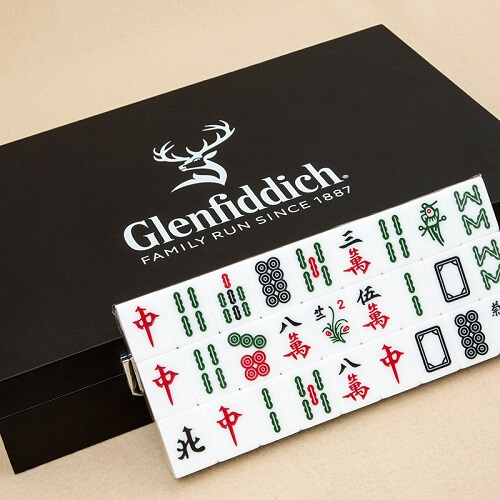
Start with the surface people ask about first. The face of a mahjong tile carries the information the game is played on: the three suits, the winds, the dragons, the flowers and seasons. Every square millimetre of it is doing a job. There is no dead space to put a logo into, and the moment you add one you have altered a piece of playing equipment that has looked essentially the same for well over a century.
There is a narrow exception. The white dragon is traditionally either blank or carries a simple frame, and some buyers ask about placing a mark there. Our advice is still no, for a practical reason rather than a sentimental one: there are four white dragons, they are live tiles in play, and a company mark on four tiles and not the other 140 is exactly the readability problem described above. If you want a game set that gets played, treat the 144 faces as finished artwork you have been given, not as a canvas.
Seven surfaces, ranked by how safely they take a mark
| Surface | Effect on play | How visible it is in use | Verdict |
|---|---|---|---|
| Case exterior | None | Seen at every set-up and pack-away, and whenever the case sits in a cupboard | Safest. Start here. |
| Wind or dealer indicator | None — it is not a playing tile | Sits in the centre of the table for the whole game | The best-value spot on the whole set |
| Mat, corner or border | None if kept outside the wall footprint | Under every hand, for hours | Excellent, with a size rule attached |
| Gift box or sleeve | None | Once, at the handover | Good for presentation, poor for longevity |
| Dice | None if all faces and pip counts stay correct | Handled every single hand | Charming, small, needs care |
| Tile backs, all 144 | None only if every one is truly identical | The most-seen surface in the game | The prize, and the risk |
| Spare blank tiles | Ruins them for their actual purpose | Rarely seen | Avoid — see below |
The spare-tile trap. Sets normally ship with a small number of blank spare tiles so a lost tile can be replaced. Branding those spares looks like free space, but the moment one goes into play as a replacement it is a tile with a mark on it that no other tile has — the exact defect you were trying to avoid. Leave spares blank, or mark them on the side edge where they cannot be read from above.
If you do brand the tile backs, brand them properly
A logo on the back of every tile is the most powerful thing you can do with personalised mahjong tiles, because the backs are what players look at for most of the game. It is also the hardest thing to get right, and it needs three production commitments in writing.
- Fixed registration. Tiles are held in a jig so the mark lands in the same place every time. Ask what the jig tolerance is and insist the mark is centred, because a centred mark is the most forgiving of small drift.
- One decoration pass. A single-colour, single-pass mark is far more consistent across 28,800 tiles than a multi-colour build-up where each colour can shift independently.
- Uniform wear. Whatever method you choose has to wear evenly, because uneven wear recreates the readability problem after a year of play rather than on day one.
Engraving, pad print and UV print on a tile back
| Method | What it gives you | How it survives the wash | Watch out for |
|---|---|---|---|
| Laser engraving | A mark cut into the material — permanent, tactile, single tone | Best. Nothing sits on the surface to rub off | You get the colour the material gives you, not your brand colour. Test on the actual back colour first |
| Engrave and colour-fill | Depth plus a chosen colour, matching how the tile faces are made | Very good — colour sits below the surface plane | Fine lines can starve of fill; needs a slightly bolder artwork |
| Pad printing | Accurate brand colours, fine detail, fast across large runs | Moderate — a thin ink film on a hard surface that is deliberately abraded every hand | Ask for a hard-wearing ink system and check the sample after a hard wash |
| UV printing | Full colour, gradients, photographic artwork | Weakest of the four here — a raised layer catching every edge | Better on a case or a mat than on a tile back |
Material decides how each of these behaves, which is why decoration should be settled after the tile spec rather than before it. If you have not fixed the tile yet, start with tile material, weight and the sound a good tile makes, then come back to this decision.
The three quiet opportunities: indicator, dice, case interior
The wind indicator
The dealer and prevailing-wind indicator is the most under-used surface on a mahjong set. It is not a playing tile, so nothing about marking it affects the game. It sits in the middle of the table from the first hand to the last, in everyone’s eyeline, being picked up and turned. If you only get one branded element on the table, put it here.
The dice
Dice can carry a small mark, most commonly in place of the single pip on the one face. Two conditions apply and they are not negotiable: every face must still carry its correct pip count and remain legible at a glance, and the dice must remain physically symmetrical. A logo recessed to a different depth on one face is a fairness question, not a design question. Keep the mark shallow, keep it on one face, and check the sample by rolling it fifty times to see nothing obviously favours a side.
The inside of the case lid
The lid interior is seen every time the set is opened and never seen by anyone else, which makes it the right place for the sentence you would not put on the outside — a long-service message, a date, an anniversary line. It is the one surface where a plate, a printed panel or a foiled label is genuinely appropriate, because nothing there is ever shuffled.
Colour: what is established, and what to ask
Two things are widely established in Chinese custom and safe to design around. Red is the colour of celebration and festivity, and gold is associated with prosperity — which is why so much festive corporate gifting in Malaysia lands on red and gold, and why a red-and-gold case reads as celebratory to most recipients without any explanation. Equally established is that white and black used on their own carry funerary associations, which is why an all-white presentation box is a risk at a festive handover even when it looks beautiful in a studio photograph.
Beyond those two points, be careful. Claims about lucky numbers, tile arrangements, the direction a set should face or which suit is auspicious vary between families, dialect groups and regions, and we are not going to assert them to you as production advice. The professional way to handle it is to ask rather than to guess. Three questions to put to the recipient’s team before artwork:
- Is there a colour, number or motif your leadership would prefer we avoid on a festive gift?
- Should the message be in English, Bahasa Malaysia, Chinese, or a combination — and who signs off the Chinese wording?
- Is this set going to one audience or several, and does anything need to change between them?
Those three questions take one email and remove the entire category of problem. Note that if the answer to the third question is yes, you have a segmentation problem at goods-in as well, and it is worth reading how we handle counting a set before it leaves the warehouse when more than one version is in the same delivery.
Artwork rules for a very small surface
- Send the logo as vector. A tile back is a small area and any raster artwork will show its limits immediately.
- Supply a one-colour version. Whatever your brand guidelines say, the tile back wants a single-colour mark. Decide now what that version looks like rather than letting a factory decide for you.
- Drop the tagline. Small type on a tile back reads as a smudge and wears first. The mark alone, at a comfortable size, beats a mark plus five words of strapline.
- Give the mark clear space. Keep it away from the edges, where the radius curves away and where wear concentrates.
- Approve on a real tile. A rendering on a screen will not tell you how a mark sits on a curved-edge, high-gloss, coloured back. Ask for a physical first article on the actual production tile.
The fan test, before you approve the run
When a branded first article arrives, do this before anything else. Take at least twenty branded tiles, lay them face down in a row, and look straight down at them from standing height for five seconds. Do not study them; glance. If any one tile draws your eye, it will draw a player’s eye across a table. Then turn the row over, shuffle, lay them face down again, and glance a second time. Two glances, ten seconds, and you know whether the run is safe to release.
The counter-intuitive lesson from years of this work is that the branded sets which actually get played are the ones branded least on the tiles themselves. A restrained mark on every back, a proper logo on the case and indicator, and a message inside the lid will outlive a heavily decorated set every time — and it leaves you free to spend the effort on choosing the mat and case that carry the set.
Common questions
Can we put our logo on the tile faces?
It is technically possible and we advise against it. The faces are the game’s information layer, and altering them makes the set harder to play and less likely to be played. Every objective we have ever been given for a branded set is better served by the back, the indicator, the case and the mat.
Will a logo on the tile backs make the set unplayable?
Not if it is on all 144 tiles, in the same position, applied in the same pass, and it wears evenly. Those four conditions are the whole job. Ask your supplier to confirm them in writing and to prove them with a fan test on the first article.
Engraved or printed on the backs?
Engraved, if you want the mark to be there in a decade and you can live with a single tone. Printed, if brand colour accuracy matters more than longevity. There is no third answer that gives you both on a surface that is deliberately abraded every hand.
What is the minimum order and how long does it take?
Minimum order is 200 sets. Allow 20 to 30 working days after artwork approval depending on quantity, plus around 15 days shipping. An express route of 10 working days is available on limited models and quantities. Build in time for a physical first article — on a game set it is the step worth waiting for.
Send us the logo and we will tell you where it should sit
Send the vector file and tell us who the sets are going to. We will come back with a placement recommendation across the tile backs, indicator, case and mat, plus a free mockup. As a logo mahjong set supplier KL teams work with directly, we would rather talk you out of a bad placement than take the order. Minimum 200 sets, nationwide delivery, SST-registered invoicing.
WhatsApp +60 10 717 5924 or use our contact page. AS80, Jalan Hang Tuah 4, Taman Salak Selatan, 57100 Kuala Lumpur.