
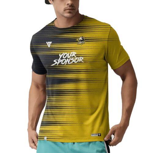
The Sleeve Lies: How to Read a Jersey Mockup Before You Approve It
A sponsor signed off a sleeve logo on a mockup where the sleeve was drawn as a neat trapezoid facing the viewer. On the finished jersey, a good half of that logo had wrapped around to the back of the arm, where the sponsor’s marketing manager could not photograph it. Nothing had gone wrong in production. The mockup had simply drawn a tube as if it were a flat panel, and everybody had approved the drawing rather than the garment.
A sublimated jersey is printed flat and then cut and sewn into a three-dimensional object. The approval document you are sent is a flat illustration of a three-dimensional object. This article is about the gap between those two things — where a mockup systematically misleads you, what the production layout underneath it actually shows, and the checks that take ten minutes and save a rebuild.
There are two documents, and most buyers only ever see one
The mockup is a rendered picture of the finished jersey: front, back, sometimes a sleeve, drawn on a garment silhouette. It exists to answer one question — do you like it. It is the right tool for that job and the wrong tool for every other job.
The panel layout is what the factory actually works from: the flat pattern pieces with your artwork positioned on them, seam allowances drawn in, safe areas marked, and placements measured from a fixed construction point rather than from the edge of the drawing. It answers the questions that matter after you have said you like it — will the logo survive the cut, will the number clear the seam, will the sleeve mark end up where the sponsor expects.
You are entitled to ask for both. On team jersey printing in Kuala Lumpur, we issue the free digital mockup around one business day after the brief, and we will walk through the placement logic underneath it with anyone who wants to see it. Buyers who ask for that second conversation almost never need a second sample.
The sleeve is the least trustworthy part of any mockup
A sleeve is a tube. Flattened onto a page it becomes a shape that appears to face the viewer entirely, which is why sponsors keep approving sleeve placements that turn out to be half hidden. On a worn jersey, only the part of the sleeve forward of its own centre line is visible from the front. Everything behind that line reads as the back or the underside of the arm.
Three rules follow, and they are worth stating in the brief rather than discovering at sample stage:
- Place a sleeve logo forward of centre. If it is meant to be seen and photographed, it belongs on the front half of the sleeve, not centred on the flat panel.
- Measure from the shoulder seam, not from the cuff. Sleeve length changes across the size range. A placement specified as a distance up from the hem of the sleeve will sit at a different height on the arm on every size you produce. A placement measured down from the shoulder seam stays put.
- Keep it clear of the underarm seam. The underside of the sleeve joins the side of the body. Artwork that runs into that junction is asking two curved pieces to align at exactly the point where the garment is under the most sewing stress.
Raglan or set-in changes the shoulder completely
A set-in sleeve joins the body at a roughly vertical seam around the armhole, leaving a clean shoulder area on the body panel. A raglan sleeve runs diagonally from the underarm up to the neckline, which removes that shoulder area entirely and replaces it with a strong diagonal line. If your design includes a shoulder stripe, a shoulder-crossing pattern or a flag on the shoulder, the sleeve construction is not a detail — it decides whether that element can exist at all. Settle it before artwork, not after.
The chest is curved and the drawing is not
A wide sponsor block drawn as a crisp rectangle across the chest of a mockup will sit, in real life, over a curved surface that moves. The wider the element, the more it bows visually towards the sides. Text is where this shows first: a single long line of type running most of the width of the chest looks straight on paper and subtly arched on a wearer.
The practical rule our artwork team uses is to keep anything whose straightness matters — a wordmark, a rule line, a row of sponsor logos — within the flatter central zone of the chest, and let decorative pattern take the curved outer areas where a little distortion is invisible. Nobody notices a bowed gradient. Everybody notices bowed type.
The neckline eats the middle of your best branding area
On a mockup, the upper chest looks like a generous open field. On the garment it is interrupted by the neckline and the binding that finishes it. A round neck takes a shallow bite. A V-neck takes a deeper, tapering one, and the point of the V is formed by a separate binding strip mitred where the two sides meet — a construction detail that occupies real space and through which no artwork runs.
The consequence is simple and repeatedly missed: a crest centred on the upper chest of a round-neck design will not sit in the same place on a V-neck version of the same design. It has to drop, or offset to one side, or shrink. If you are producing the same identity across more than one neckline, expect to see more than one mockup, and check that what a sleeveless jersey does to your branding area has been accounted for too — that version loses the sleeve placements altogether.
Nine checks to run on a jersey mockup before you sign it
This is the list we hand to buyers who are approving on behalf of a committee, a sponsor or a school. Working through it takes about ten minutes and it is the single highest-value ten minutes in the entire order.
| Check | What you are looking for | If it is missing |
|---|---|---|
| All views present | Front, back and both sleeves shown, not just a hero front view | Ask for the missing views before approving anything |
| Safe areas visible | Seam and hem zones indicated, not just the artwork floating | Ask to see the layout view instead of the render |
| Sleeve placement reference | Measured down from the shoulder seam | Expect the logo to wander across the size range |
| Back number clearance | Digits clear of any yoke seam, horizontal band or contrast panel | The seam will cut the number, and it will be obvious |
| Seam-crossing elements | Anything critical running through the side or underarm seam | Move it, or accept a visible break in the element |
| Size extremes | The design shown on the smallest and largest garment you are ordering | Ask — a mockup is usually drawn at one size only |
| Binding and trim colours named | Neckline, armholes, cuffs, and thread tone | Stock colours will be used by default |
| Logos at final size | Vector artwork, not an enlarged screen grab from a website | Soft edges on the finished garment, and no way to fix it later |
| Named approver and date | One person owns the sign-off, in writing | A committee will relitigate the design after production starts |
The question a flat mockup never answers: which size is that?
A mockup is drawn once, usually on a mid-range silhouette. Your order is not one silhouette. Artwork placed comfortably on a mid-size back panel may crowd the seams on the smallest garment in the run and float in the middle of the largest. A repeating pattern can also change character across sizes if it is scaled rather than repositioned.
So ask two questions of any mockup: which size does this represent, and what changes at the extremes of the range. On a strong design the answer is “nothing important”, because the critical elements were placed relative to construction points rather than to the outline of one drawing. On a fragile design the answer is a list, and it is much better to have that list before the transfer roll is printed than after — particularly on personalised kit, where the roster freeze date on a personalised kit has already locked a separate file for every garment.
What to send so the layout can be built properly the first time
- Vector logos in AI, EPS or PDF, with type converted to outlines. A logo lifted from a website will not enlarge cleanly onto a chest.
- Colour references for the main colourway and any sponsor colours, so nobody is matching to a screenshot.
- The sport and the neckline, because both change the usable branding area before a single element is placed.
- Sponsor priority order — who must be visible from the front, who can live on a sleeve, who can go on the back below the number.
- The size range you expect to order, including youth sizes if any, so placements can be checked at the extremes.
- The date the kit is needed, which sets every deadline behind it.
Aquaholic has been a Singapore-based corporate gifting specialist since 2003 and now produces team kit for Malaysian clubs, companies and schools from Kuala Lumpur. The mockup stage is where nearly every avoidable problem in a sublimated order is either caught or created — the second-largest source being surprises about the parts of a jersey that never take dye.
Questions buyers ask about jersey mockups
Is the digital mockup free, and how long does it take?
Yes, the digital mockup is free, and it is usually with you around one business day after we have your brief, logos and colourway. Revisions before approval are part of the process — the mockup stage is exactly where changes are cheap.
Why does our sleeve logo look smaller on the real jersey?
Because a sleeve is a tube and the mockup drew it flat. Only the forward half of the sleeve faces the viewer. Place anything that must be seen on the front half of the sleeve and it will read at full size.
Can a design continue across the shoulder onto the sleeve?
It can, and it looks excellent when it is planned. It has to be drawn on the panel layout rather than on the render, and the sleeve construction matters — a raglan seam runs diagonally and will interrupt anything drawn as if the shoulder were flat.
Do we need a physical sample before the full run?
For a first-time design with sponsors, complex panelling or a solid dark colourway, a physical sample is worth the time it adds. For a repeat of a design we have already produced, the mockup plus the previous production record is normally enough.
What is the jersey minimum order and the lead time?
Minimum order is 100 pcs per design. Production runs 21–45 days after artwork approval, plus around 15 days for shipping and delivery nationwide. Express production of 10 working days is available on limited styles and quantities. Quote-only, SST invoiced, ePerolehan-ready for government buyers.
We will show you the layout, not just the pretty picture
Send your logos, colourway and sport and we will come back with a free mockup plus the placement reasoning behind it — sleeve position, number clearance, binding colours and safe areas. Browse our custom jersey options to see what the cut choices look like first.
WhatsApp your artwork
Get a free mockup
Aquaholic Gifts Malaysia · AS80, Jalan Hang Tuah 4, Taman Salak Selatan, 57100 Kuala Lumpur · nationwide delivery


