Ink on a Ball That Gets Bounced: Where Branding Survives on a Pebbled Basketball
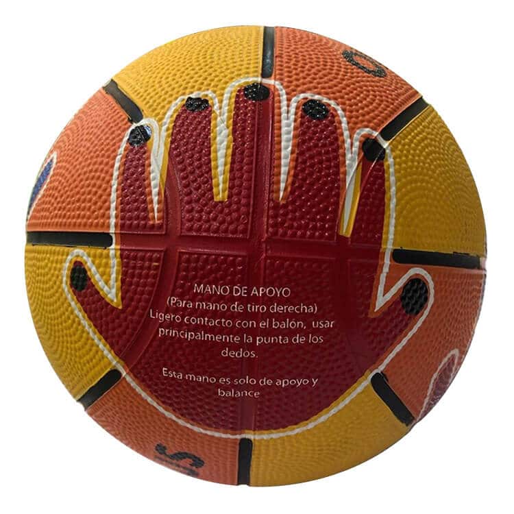
A logo on a basketball does not fade. It speckles. That distinction is the single most useful thing a buyer can understand about branding a ball that gets bounced, and almost nothing written about promotional printing explains it, because almost nothing written about promotional printing is about a pebbled surface. Ink on a basketball sits on the crowns of thousands of raised bumps. The crowns are the only part of the ball that meets the floor. So abrasion does not sand the logo evenly — it removes colour from the high points and leaves it in the valleys, and what you see after a few weeks is a logo that has gone slightly grainy and pale, like a printed image losing its dots. This article is about designing for that, about the one part of the ball where abrasion cannot reach, and about a two-week test we would rather you ran on a sample than discovered on the delivered order.
The short version. On a pebbled cover, artwork survives in proportion to how much of it is carried by more than one pebble crown. Thin lines and small type die first because a handful of crowns carry them. Solid shapes survive because losing crowns only makes them look textured. The channels are the safest real estate on the whole ball because they never touch the ground. And you can find out how your specific artwork behaves in about a fortnight, before you commit.
Why the crowns are the whole story
Picture the cross-section of a pebbled cover: a wavy line of little domes with valleys between them. When that surface is printed — whatever the process — the coating lands most heavily on the tops of the domes and thins as it runs down the sides. Some ink reaches the valleys. Less of it, and less firmly attached, because the geometry works against the transfer.
Now bounce the ball. Only the crowns contact the floor, so only the crowns are abraded. The result is a wear pattern that is invisible for the first week or two and then, quite suddenly, obvious: the logo appears to have lost density rather than lost edges. Buyers describe this as the print “fading” and assume the ink was poor quality. It usually was not. The ink was fine. The surface it was sitting on was the wear surface.
This is also why the same artwork on the same ball behaves completely differently depending on where the ball lives. On a sealed indoor floor the crowns polish rather than grind, and a print can look good for a very long time. On raw outdoor concrete the crowns are being truncated within weeks, and the print goes with them. The mechanism is set out in more detail in our piece on grain height and channel depth explained — the short version is that print life and grip life are the same clock.
Design rules that follow directly from the crowns
Once you accept that the printed image is being reconstructed by your eye from a field of coloured dots, the design guidance stops being arbitrary and starts being arithmetic.
Stroke weight beats detail, every time
A hairline rule in a logo may be carried by a single row of crowns. Abrade a proportion of them and the line becomes a dotted line, then disappears. Thicken the same rule so it spans several crowns and it degrades gracefully — it thins visually, but it stays continuous. When we look at a client’s logo for a ball, the first thing we check is the thinnest element in it, not the overall size.
Small type is the first casualty
Counters — the enclosed holes in letters like a, e and o — fill in visually as soon as the surrounding crowns start losing colour, and fine serifs vanish. A tagline that reads perfectly on a mockup at screen resolution can be illegible on a played ball. If a strapline matters, set it larger and heavier than you would on a flat print, or move it into a channel where nothing abrades it.
Solids and bold shapes are the survivors
A filled shape can lose a substantial share of its crowns and still read as the shape, because the eye fills in. This is the reason a simplified, one-colour version of a corporate mark is very often the better artwork for a ball, even when the supplier can technically print the full-colour original. Fewer, bigger elements age better.
Colour choice decides how visible the wear is
Wear reveals the base colour of the ball through the print. The greater the contrast between ink and base, the more dramatically the wear announces itself: white on a dark ball, or black on orange, both flag every lost crown. An ink closer in value to the ball hides ageing far better, at the cost of impact on day one. There is no right answer — but it is a decision worth making deliberately rather than by default.
Local tip. If the balls are for a Malaysian outdoor court and the brand allows it, ask for a two-version mockup: your full logo on the panels, and a simplified single-colour lockup in the channels. Approving both and putting the simplified version where nothing touches it is the closest thing to insurance that exists on this product.
The channels: branding real estate with no wear
A channel is recessed below the surrounding pebbles by design. That means the floor never touches it. Whatever is printed there is protected from the abrasion that is quietly removing your panel artwork, and the only thing that reaches it is grit — which wipes out.
Two constraints come with the territory. The first is shape: a channel is a long narrow strip that curves around the ball, so it suits a wordmark, a repeated brand name, a hashtag, a date or a contrast colour, and it does not suit a square logo. The second is registration: printing accurately into a recess on a curved surface is a more demanding operation than printing on a panel face, so the tolerance is coarser and artwork needs breathing room rather than tight alignment to the channel edges.
There is also a middle zone worth knowing about — the shoulder, the small band where the panel face curves down into the channel. It is partially sheltered, so branding there ages more slowly than mid-panel branding, and it takes artwork more easily than the channel floor. On balls where the channel itself is too narrow, the shoulder is the fallback. Whether any of these zones is available depends on your cover, which is the other half of this decision and is covered in the indoor, outdoor and composite distinction.
The two-week bounce test
This is the protocol we would like every client to run on the pre-production sample before approving artwork for the full order. It is deliberately low-tech, it needs no equipment beyond a phone camera and a court, and it answers the only question that matters: will this artwork still look like our brand in a month?
| Stage | What to do | What you are looking for |
|---|---|---|
| Day 0 — baseline | Photograph every branded area in daylight, from a fixed distance, with a ruler in frame | A reference you can genuinely compare against later — freehand phone shots are useless for this |
| Day 0 — thumbnail test | Scratch firmly across a printed crown area with a thumbnail | Colour transferring to the nail, or a bright scratch line, means adhesion has already failed — stop and reject |
| Day 0 — tape lift | Press clear tape hard over a printed area, leave briefly, pull off sharply | Ink on the tape. Any at all is a conversation to have before production |
| Days 1–10 — real use | Ten minutes of dribbling a day, on the actual surface the balls will live on | Nothing yet — this stage is just accumulating honest wear |
| Day 5 — wet session | One session with wet hands, then wipe dry with a cloth | Colour on the cloth, softening or lifting at the artwork edges |
| Day 7 — sun exposure | Leave the ball outdoors through a full day of Malaysian sun | Colour shift, gloss change or any tackiness in the printed areas |
| Day 14 — verdict | Rephotograph from the same distance in the same light and compare side by side | Is the mark still legible at arm’s length? Are the thinnest elements still continuous? Are the channels holding up better than the panels? |
The decision rule we suggest: if the artwork is still legible at arm’s length after the fortnight and only the finest details have softened, approve it. If a specific element has broken up — a thin rule, a strapline, a registration mark — do not reject the whole design, remove or thicken that element and move it. In our experience that single edit resolves the majority of these cases, and it costs nothing at mockup stage.
Plan the test into the calendar, not around it. A digital mockup normally comes back within about one business day. Production runs 21–45 days after artwork approval, with roughly 15 days for shipping and nationwide delivery on top. A fortnight of testing therefore has to sit before approval — so if you have a tournament or a launch date, count backwards from it and ask for the physical sample in the first week of the project. Express production of 10 working days exists for limited styles and quantities, but it shortens the production window, not the testing one.
What to send us for a basketball print
Vector artwork — AI, EPS or a vector PDF — with fonts converted to outlines, and named brand colours rather than a screenshot. Tell us the thinnest stroke in the file and whether it is negotiable, because that is the element most likely to need adjusting. Flag anything that must not be altered: a registered mark, a sponsor lock-up with contractual sizing, a government or association crest.
What comes back is a digital mockup showing placement and indicative size on the actual ball shape, with the branded areas marked. Panels take full-colour artwork and are the boldest statement; multiple panels give repeated branding; a full wrap puts an all-over design across the ball; and packaging can carry its own offset-printed branding. Exact areas are confirmed on the mockup, not promised in advance, because they vary with grade and size. You can see how the placements sit together on our branded basketballs for Malaysian teams page.
Basketball branding questions we get asked
Will printing on a basketball affect how it plays?
A modest logo on the panels, no. A heavy full-wrap coating across the whole surface changes the hand feel because it sits on the crowns and slightly reduces the effective grain, which is most noticeable with a damp hand. If the balls are genuinely going to be played with, keep the coverage proportionate and put the detail in the channels.
Why does my logo look different on the ball than on our other gifts?
Two reasons. The surface is textured, so colours read slightly darker and edges slightly softer than on a flat substrate. And the ball is curved, so a logo photographed head-on is compressed at its edges. A mockup on the ball shape rather than a flat proof avoids most of the surprise.
Can the print be made abrasion-proof?
No, and be wary of anyone who says otherwise. Ink on the crowns wears when the crowns wear. What you can do is choose placement that avoids contact, artwork that degrades gracefully, and a cover matched to the surface. That combination is what makes a printed ball still look good a year in.
Is a full-colour design worth it on an outdoor ball?
It depends on the design. Full-colour with large, bold areas ages well. Full-colour with photographic detail or fine gradients does not, because the detail is what the crowns were carrying. If the ball is going onto concrete, spend the budget on a simplified, high-impact design rather than a complex one.
What is the basketball minimum order, and can we test before committing?
Minimum order is from 300 pcs, quoted against your grade, size and branding, with an SST invoice and ePerolehan-ready documentation where a government buyer needs it. Yes — ask for the pre-production sample and run the two-week test on it. That is what the sample is for.
Send the logo — we will tell you which parts of it the ball can carry
We will mark up your artwork for panel and channel placement, flag the elements that will not survive a concrete court, and put it on a mockup usually within one business day. Aquaholic Gifts is a Singapore-based corporate gifting specialist working since 2003, now serving clients across Malaysia from Kuala Lumpur. Or see the full basketball branding line-up first.
AS80, Jalan Hang Tuah 4, Taman Salak Selatan, 57100 Kuala Lumpur · MOQ from 300 pcs · quote-only, SST invoice, ePerolehan-ready